Film poster research
Create a blogpost called 'Film poster research and pre-production' and work through the following tasks to complete your research and planning for the print side of the brief:
Film poster conventions
Do some generic research on film posters.
1) List the key conventions of a film poster.
tagline
reviews and star ratings
image
name of director/stars/ references to other films they have starred in
screening details
production company, writers and stars
title
colour scheme
actors
classification and parental guidance
iconography
gratifications
production logo
credit block
2) What makes a film poster instantly recognisable?
I think the actors are usually the focal point of the poster, especially if they are a popular, recognisable star. I think the location makes it recognisable as the audience can identify with the characters because the location is recognisable.
3) What are regarded as some of the best film posters of all time? Why?
- Jaws - The image of the great white shark was terrrifying because it was oversized and had rows of jagged, uneven teeth that in reality scared people from swimming and going to the beach

- Vertigo - The disorientating poster was Hitchcock's best as it recreated the films titular sensation and it relates to the film's opening.

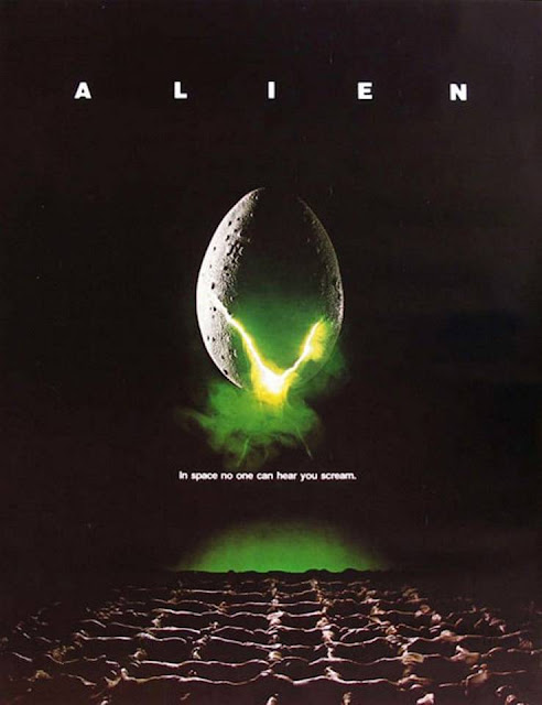
- Alien - It has a simple visual cracking egg with a creepy glow and some alien bioorganic texture on the floor which supports the chilling film tagline.
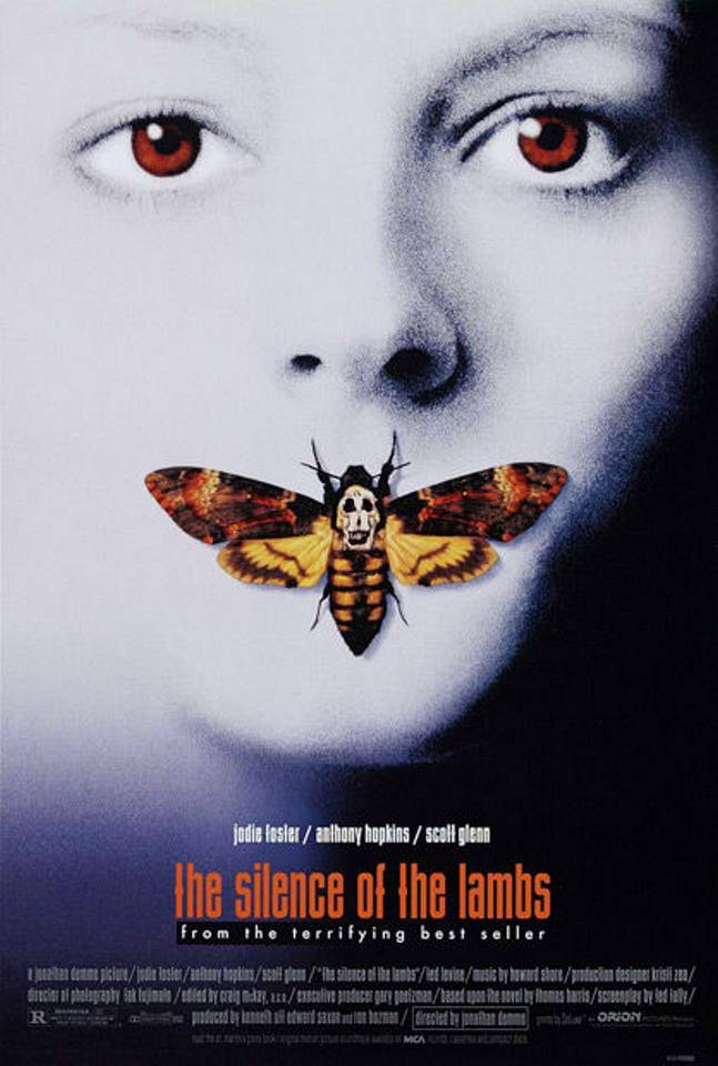
- The Silence of the Lambs - the film poster only features two powerful images, one of the female and then the death's head moth takes the central focus, the skull on it's back made up of nude female forms (lifted from Salvador Dali's 'In Voluptas Mors'.

4) Look back at your statement of intent. What are you planning to produce in terms of your film posters? Can you take inspiration from your research above?
Film poster research - genre
Go back to the five film trailers you researched in your chosen genre (and additional films if you wish). For each film, find at least three different film posters for the film and analyse the following:
- The Edge of Seventeen
- The Perks of being a Wallflower
- Boyhood
- Love Simon
- The Diary of a Teenage Girl
The Edge of Seventeen:


2) What differences can your find between the alternative posters for the same film?
However, one fillm poster features the main character and then shows her teacher Mr Bruner who acts as her guide throughout the film. For this film poster the background seems to be of a classroom, this suggests that her teacher helps her through the film and gives her guidance or advice.
3) What target audience do you think each poster is targeting and why? How can you tell?
I think the film posters with the main character alone is targeting teens alone especially those who go to High School and are struggling with friends and popularity, but also those teens who seem 'lost' and who need help. The film poster featuring the teacher is targeting older adults, especially teachers suggesting that they are supposed to be the ones who can speak to students act as their mentor.
4) What can you use from these posters in your own film poster planning and production?
One film poster features the main character and her two best friends in the background. She seems to be confused or like she is struggling, I could do the same so my main character and then her best friend behind her on one side and then the evil jealous girl on the other side.
The Perks of being a Wallflower:


1) What conventions are the same on each poster for the same film (i.e. the film's consistent branding)?
Every film poster features the three main characters as the whole narrative revolves around them and their struggles of being teenagers.All the posters show that the three friends seem to enjoy themselves when they are together. The positioning of the characters also conveys to the audience how close the three friends are. In all the film posters it shows the characters of Sam resting her head on Charlie's shoulder and Ezra standing beside them.
2) What differences can your find between the alternative posters for the same film?
The colour of the background changes from blue to green as well as the font style of the way the title is written. The positioning of the title changes in the third film poster, the font gets larger and features star ratings and review quotes.
3) What target audience do you think each poster is targeting and why? How can you tell?
I think theses film posters are targeting a young audience, teenagers ages between 13-19 as they are the ones who would be in High School.
4) What can you use from these posters in your own film poster planning and production?
I think I would use the bold font title, I think it stands out and gives it a sense of excitement.
Boyhood:


1) What conventions are the same on each poster for the same film (i.e. the film's consistent branding)?
- same image used
- the same typography has been used
- at the bottom of each poster, there is a credit block
2) What differences can your find between the alternative posters for the same film?
- same image use in all three posters but in different directions
- same mise-en-scene
- different review quotes
3) What target audience do you think each poster is targeting and why? How can you tell?
I think theses film posters are targeting a young audience, teenagers ages between 13-19 as they are the ones who would be in High School.
4) What can you use from these posters in your own film poster planning and production?
I like the simplicity of the film poster and the background image. Also, I could use the same way of placing the information on my film poster.
Love Simon:


1) What conventions are the same on each poster for the same film (i.e. the film's consistent branding)?
- same colour scheme of red, black and white
- the main character is featured on all three posters
- two out of the three posters have the same log line " everyone deserves a great love story "
2) What differences can your find between the alternative posters for the same film?
- all the film posters features the same range of people
- the positions of the actors are different
- one poster features the main character alone
3) What target audience do you think each poster is targeting and why? How can you tell?
I think theses film posters are targeting a young audience, teenagers ages between 13-19 as they are the ones who would be in High School. I think this is aimed at teenagers who are facing the same issues such as trying to find their own identity.
4) What can you use from these posters in your own film poster planning and production?
I think i would take the idea of having a consistent colour scheme as it makes the posters link better and make it recognisable for the audience.
The Diary of a Teenage Girl:


1) What conventions are the same on each poster for the same film (i.e. the film's consistent branding)?
- all posters contain the same three characters
- the same three positions
- the same outfits
- the same background setting in each photo
2) What differences can your find between the alternative posters for the same film?
- three different styles are seen
- a contemporary vintage look
- a cartoon, book like style
- a 60's vibe film poster
- different review quotes
- only one film poster has film festivals
3) What target audience do you think each poster is targeting and why? How can you tell?
I think theses film posters are targeting a young audience, teenagers ages between 13-19 especially females as the film revolves around a female lead.
4) What can you use from these posters in your own film poster planning and production?
I like the idea of having three completely different posters as it gives the film different identities.
Planning and sketching
1) Create a spider diagram or bullet point list of everything you plan to include in your film posters AND all the ways you could target the three target audience segments outlined in the brief: fans of the genre, males, females. Make sure you also create a local film festival in order to meet this aspect of the brief.
First poster (fans of the genre)-
- medium shot or close up of the main protagonist looking confused or as if she is staring into nothing
- she could be standing with her diary
- her diary could be opened and she could look upset
- Title
- Hashtag
- Release date
- Credit block
- Age range
- Empire review
Second poster (females)-
- Medium shot of the evil jealous girl and the main protagonist as well as her best friend standing together .
- Title
- Hashtag
- Release date
- Credit block
- Age range
- Film festival awards
Third poster (males)-
- Medium shot of protagonist standing in the centre, or featured with her friends
- Title
- Hashtag
- Release date
- Credit block
- Age range
- Film festival awards
2) Produce an A4 sketch for your first film poster, adding significant detail in terms of text and planned images (you don't need to draw the image if you don't want to - but must offer a detailed text-based description if not). Clearly label which segment of the target audience you are aiming for with this poster and where the poster will be displayed (outside location, magazine or newspaper etc.) Remember that each poster can either be landscape or portrait and also needs to link to the local film festival that will be screening the film (see details in brief above). When you have sketched the poster, scan or photograph it and add it to your blogpost.
Fans of the genre

3) Produce an A4 sketch for your second film poster, clearly identifying the segment of the target audience this poster will be aiming at. Pay particular attention to details you will either keep consistent (to create a brand identity and cover the local film festival aspect) or change (to alter the target audience). When you have sketched the poster, scan or photograph it and add it to your blogpost.
Females

4) Produce an A4 sketch for your third film poster, clearly identifying the segment of the target audience this poster will be aiming at. Pay particular attention to details you will either keep consistent (to create a brand identity and cover the local film festival aspect) or change (to alter the target audience). When you have sketched the poster, scan or photograph it and add it to your blogpost.
Males

Photoshoot planning
1) Which of your characters will appear on each poster? If the characters will be the same on each poster, how will you differentiate the images?
My main character will appear on the film poster, and maybe on a landscape film poster her best friend will feature on it. This is because she plays a significant role within the film. I think each poster I will have my main character showing different emotions in order to show the audience that this film is worth watching.
2) What images do you need for each film poster? Write a detailed description.
I would need images of the main character, I would take medium close ups of the character and maybe some long shots similar to the edge of seventeen poster.
Similar to the Love Simon poster I would have the group of people within the image
3) Write a shot list for the photoshoot(s). Make sure you plan a variety of camera shots you will look to capture (medium shots, close-ups etc.) to give yourself flexibility when designing the posters in Photoshop later. Will the photoshoot be out on location or in school with the white backdrop and lighting?
4) What costume, props or make-up will you require for the photoshoot(s)?
- Simple makeup in order for the main character to look innocent
- props would be the secret diary and maybe a pen

Comments
Post a Comment